Question:
The graph below shows the supply and demand curves for
Last updated: 9/17/2023
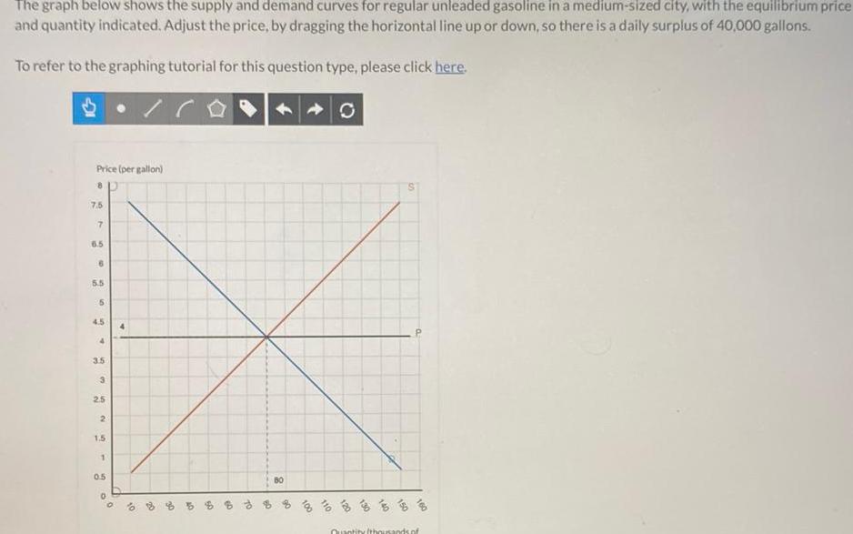
The graph below shows the supply and demand curves for regular unleaded gasoline in a medium sized city with the equilibrium price and quantity indicated Adjust the price by dragging the horizontal line up or down so there is a daily surplus of 40 000 gallons To refer to the graphing tutorial for this question type please click here Price per gallon 8 7 5 7 6 5 6 5 5 5 4 5 4 3 5 3 2 5 2 1 5 1 0 5 0 4 0 20 6 OP of D 8 8 8 8 6 3 3 3 3 3 Quantity thousands of