Question:
The line graph shows the cost of inflation in some country.
Last updated: 7/28/2022
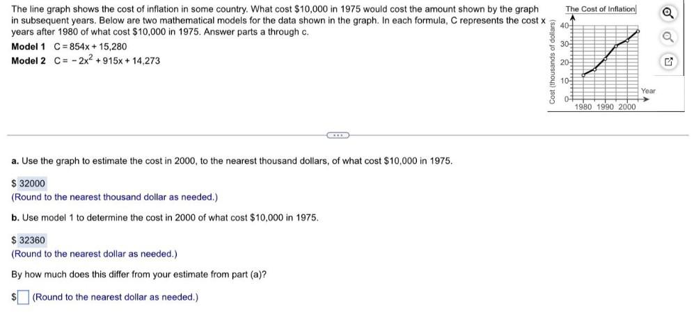
The line graph shows the cost of inflation in some country. What cost $10,000 in 1975 would cost the amount shown by the graph in subsequent years. Below are two mathematical models for the data shown in the graph. In each formula, C represents the cost x years after 1980 of what cost $10,000 in 1975. Answer parts a through c. Model 1 C= 854x + 15,280 Model 2 C= 2x² +915x + 14,273